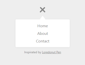
HTML
<a href="#menu" id="toggle"><span></span></a>

<div id="menu">
  <ul>
    <li><a href="#home">Home</a></li>
    <li><a href="#about">About</a></li>
    <li><a href="#contact">Contact</a></li>
  </ul>
</div>


<p>Inspirated by <a href="https://codepen.io/loredonut/pen/hjuai">Loredonut Pen</a></p>
CSS
/* Important styles */
#toggle {
  display: block;
  width: 28px;
  height: 30px;
  margin: 30px auto 10px;
}

#toggle span:after,
#toggle span:before {
  content: "";
  position: absolute;
  left: 0;
  top: -9px;
}
#toggle span:after{
  top: 9px;
}
#toggle span {
  position: relative;
  display: block;
}

#toggle span,
#toggle span:after,
#toggle span:before {
  width: 100%;
  height: 5px;
  background-color: #888;
  transition: all 0.3s;
  backface-visibility: hidden;
  border-radius: 2px;
}

/* on activation */
#toggle.on span {
  background-color: transparent;
}
#toggle.on span:before {
  transform: rotate(45deg) translate(5px, 5px);
}
#toggle.on span:after {
  transform: rotate(-45deg) translate(7px, -8px);
}
#toggle.on + #menu {
  opacity: 1;
  visibility: visible;
}

/* menu appearance*/
#menu {
  position: relative;
  color: #999;
  width: 200px;
  padding: 10px;
  margin: auto;
  font-family: "Segoe UI", Candara, "Bitstream Vera Sans", "DejaVu Sans", "Bitstream Vera Sans", "Trebuchet MS", Verdana, "Verdana Ref", sans-serif;
  text-align: center;
  border-radius: 4px;
  background: white;
  box-shadow: 0 1px 8px rgba(0,0,0,0.05);
  /* just for this demo */
  opacity: 0;
  visibility: hidden;
  transition: opacity .4s;
}
#menu:after {
  position: absolute;
  top: -15px;
  left: 95px;
  content: "";
  display: block;
  border-left: 15px solid transparent;
  border-right: 15px solid transparent;
  border-bottom: 20px solid white;
}
ul, li, li a {
  list-style: none;
  display: block;
  margin: 0;
  padding: 0;
}
li a {
  padding: 5px;
  color: #888;
  text-decoration: none;
  transition: all .2s;
}
li a:hover,
li a:focus {
  background: #1ABC9C;
  color: #fff;
}


/* demo styles */
body { margin-top: 3em; background: #eee; color: #555; font-family: "Open Sans", "Segoe UI", Helvetica, Arial, sans-serif; }
p, p a { font-size: 12px;text-align: center; color: #888; }
JS
var theToggle = document.getElementById('toggle');

// based on Todd Motto functions
// https://toddmotto.com/labs/reusable-js/

// hasClass
function hasClass(elem, className) {
  return new RegExp(' ' + className + ' ').test(' ' + elem.className + ' ');
}
// addClass
function addClass(elem, className) {
    if (!hasClass(elem, className)) {
      elem.className += ' ' + className;
    }
}
// removeClass
function removeClass(elem, className) {
  var newClass = ' ' + elem.className.replace( /[\t\r\n]/g, ' ') + ' ';
  if (hasClass(elem, className)) {
        while (newClass.indexOf(' ' + className + ' ') >= 0 ) {
            newClass = newClass.replace(' ' + className + ' ', ' ');
        }
        elem.className = newClass.replace(/^\s+|\s+$/g, '');
    }
}
// toggleClass
function toggleClass(elem, className) {
  var newClass = ' ' + elem.className.replace( /[\t\r\n]/g, " " ) + ' ';
    if (hasClass(elem, className)) {
        while (newClass.indexOf(" " + className + " ") >= 0 ) {
            newClass = newClass.replace( " " + className + " " , " " );
        }
        elem.className = newClass.replace(/^\s+|\s+$/g, '');
    } else {
        elem.className += ' ' + className;
    }
}

theToggle.onclick = function() {
   toggleClass(this, 'on');
   return false;
}
반응형